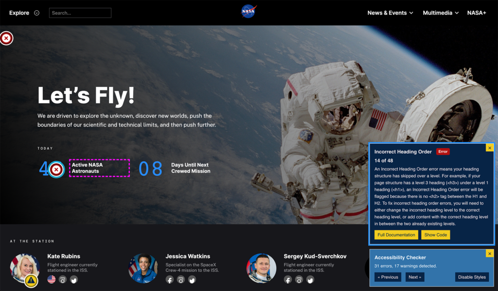
Equalize Digital Accessibility Checker Plugin Adds New Frontend Highlighting Feature Funded by NASA
…Full post on WP Tavern
Read Full

…Full post on WP Tavern
Read Full

There is a problem. Well, it is not an OMGBBQ problem, but it has the potential to become one. Maybe by calling attention to it, I will set off a landslide of copycats who will see this as another trick of the marketing trade, implementing it in their own projects. I am torn, but it…

Patchstack has published its State of WordPress Security whitepaper with a summary of threats to the WordPress ecosystem recorded in 2021. The whitepaper aggregates data from multiple sources, including the Patchstack Vulnerability Database, the Patchstack Alliance (the company’s bug bounty platform), and publicy reported CVEs from other sources. In 2021, Patchstack recorded nearly 1,500 vulnerabilities,…

When Automattic launched a mobile app for Jetpack in June 2021, it was targeted mainly at users who were on a paid Jetpack plan, as it enables access to features like backups, restores, and security scanning. Most importantly, the app gave Automattic a more direct path for monetizing Jetpack, without adding more commercial interests into…

For more than a decade, WordPress developers have been discussing how core can support plugins that require one or more other plugins in order to work. Having a standardized way of managing plugin dependencies would be a useful and time-saving feature for developers, who currently have to roll their own solutions for this. “The situation…

Automattic has acquired Texts, an all-in-one messaging platform, for $50 million. Texts is a newer company founded in 2020 that creates a centralized inbox for all major messaging platforms, including iMessage, WhatsApp, Instagram, Telegram, Signal, Twitter, LinkedIn, Slack, and Discord. The proliferation of messaging apps and inboxes has made responding to communication more complicated than…

WordPress 6.0 Beta 2 is now available for testing! This version of the WordPress software is under development. Please do not install, run, and test this version of WordPress on a production or mission-critical website. Instead, it is recommended that you test Beta 2 on a test server and site. You can test the WordPress…