
Gutenberg 14.1 Improves Navigation Block, Adds Experimental Zoomed-Out View
…Full post on WP Tavern
Read Full

…Full post on WP Tavern
Read Full
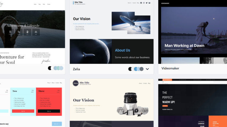
In the dawn of the block theme era, the WordPress theme directory could use a reimagining. That is what Munir Kamal set out to do before WordPress 5.9 launches later this month. He announced an alternative theme directory on the Gutenberg Hub website earlier today. It lists all the block themes that are officially hosted…

WordCamp Europe announced the first batch of tickets on sale for the 2023 event that will be hosted in Athens, Greece, June 8-10. General tickets are € 50.00, a fraction of their true cost, which is heavily subsidized by sponsors. It includes admission to the two-day event, lunches, coffee, snacks, Contributor Day, a commemorative t-shirt, and…
David Vongries, developer of the Kirki Customizer Framework plugin, announced he is sunsetting the product and will discontinue development and support. Vongries bought the plugin in 2020 from its original creator, Ari Stathopoulos, and grew its user base from 400K to 600K active installs. He launched Kirki PRO with additional extensions in March 2022. “When…

This month, as we approach WordCamp US, we feature Bud Kraus, a WordPress trainer who has made a career in helping others learn about software. He also shares how he has developed an approach to using technology in order to overcome longstanding difficulties with his eyesight. In this People of WordPress series, we share some…
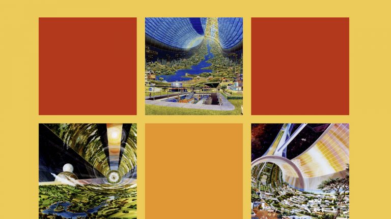
What began as a project in August 2020 has now become a reality. All past Twenty* default WordPress themes now have their own unique block patterns. In recent weeks, Twenty Ten through Twenty Fifteen received updates. Designer Mel Choyce-Dwan kick-started tickets for all previous 10 default themes before the WordPress 5.5 release, the first version…

Welcome to Press This, the WordPress community podcast from WMR. Here host David Vogelpohl sits down with guests from around the community to talk about the biggest issues facing WordPress developers. The following is a transcription of the original recording. David Vogelpohl: Hello everyone and welcome to Press This the WordPress community podcasts on WMR….