
James Koster Shares Design Explorations that Transform WordPress’ Site Editor Into a More Visual, User-Friendly Tool
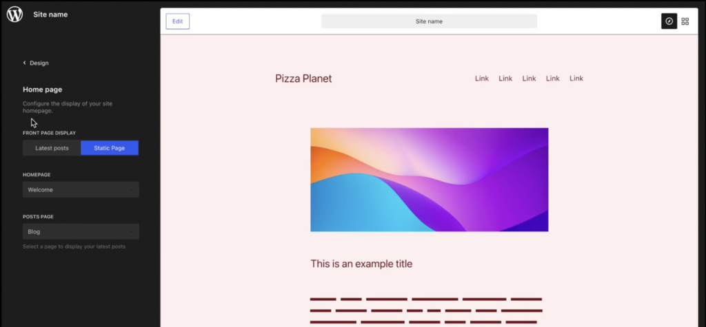
Automattic-sponsored designer James Koster has a vision for taking WordPress’ Site Editor from its beta awkwardness and transforming it to become a more visual and user-friendly design tool. In a recent post titled Revising the presentation of key Site Editor features, Koster identifies unbalanced feature weighting as a critical design flaw that is negatively impacting users’ experience with the editor: The Site Editor is a powerful tool, but the user experience lacks some coherence and a sense of hierarchy. Template management and editing has central focus, despite the fact that it’s a product area that has proven difficult for some users to interpret. Impactful features like style and menu management are hierarchically relegated, and consequently deliver a sub-optimal UX. This week I’ve been ideating on how we might present site editor features with more appropriate weighting, so that the overall experience feels more like a design tool. Instead of dropping users directly into editing the homepage, Koster contends that the Site Editor’s design should be updated to become a “navigable frame” where users can select from a menu of features and styles on the left. This is a radical improvement over the current experience, which feels like walking into a room…
…Full post on WP Tavern
Read Full