Media Queries in Responsive Design: A Complete Guide (2021)
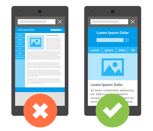
Welcome to the beginner’s guide to CSS media queries. In this article, we will take a deep dive into what media queries are, how they work, and how to use them correctly. Contrary to popular belief, they go beyond responsive design (even though this is what will focus on here). In the end, we want you to walk away with the knowledge of how to implement your own media queries to customize the way your site behaves. What Are CSS Media Queries? Media queries are basically a way to write conditional CSS. That means CSS markup that the browser will only render if certain conditions are met. Its most commonly use is in responsive design, where it’s a way to tell browsers to change the display of website elements when above or below a certain screen size. However, as we will see below, there are other ways you can use them. How Do You Write a Media Query? So, what is the correct way to use a media query? In CSS, they part of the at-rules, in this case @media. You then add the type of media you are trying to target and the feature/condition that needs to be met…
…Full post on Torque Mag
Read Full